REQUIREMENTS MET
Keeping supporting tasks in context within a loan review workflow.
ROLE
UI/UX Designer
TOOLS
Figma
WHAT I DESIGNED
-
Interaction Design
-
UI Design
-
Component Design
THE CONTEXT
Supporting decisions within the Eligibility Review
As part of the loan process, Loan Officers work through the Eligibility Review step, which includes a Requirements Met section.
The section contains a list of requirements that the Loan Officer must evaluate and indicate whether each requirement has been met.
For each requirement, the Loan Officer may need to:
• Indicate whether the requirement was met using Yes / No
• Upload supporting documentation when required
• Provide a justification for the decision
The interface also needed to indicate when supporting documentation or a justification had already been added.

Original Requirements Met screen
THE EXISTING EXPERIENCE
The actions were available — but took users away from the task
The original design used icons next to each requirement: Documents and Justification.
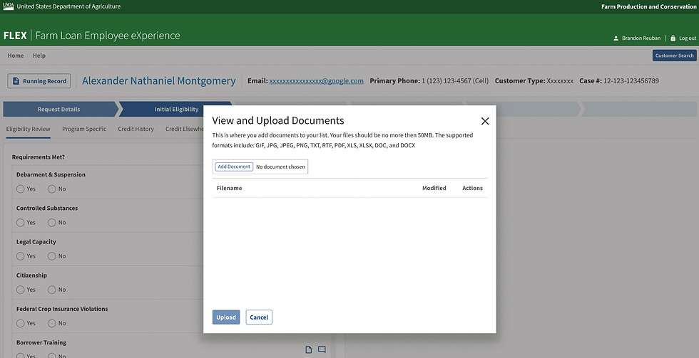
Selecting the document icon opened a modal where the user could upload supporting files. Selecting the justification icon opened a separate modal where the user could enter their comments.
Once content was added, the icons changed to a filled state to indicate that information had been captured.
The interaction worked, but it created a disconnect from the larger task. The Loan Officer was working through a list of requirements, yet completing the supporting tasks required repeatedly opening and closing separate modals.

Original documents modal
Original justification modal
THE CHALLENGE
How might we let Loan Officers complete each requirement without leaving the workflow?
The Product Owner wanted the experience to support a more continuous workflow.
Instead of: Review requirement → Open modal → Complete task → Close modal → Return to list → Repeat
The goal was to allow users to: Review requirement → Complete supporting task → Continue to the next requirement, without leaving the page.
THE DESIGN APPROACH
I brought the supporting actions into the workflow
Rather than treating Documents and Justification as separate destinations, I redesigned them as contextual actions within each requirement.
Replace ambiguous icons with labeled actions
The original design relied primarily on icons. I introduced labeled buttons such as Documents and Justification. The labels provided additional context and made the available actions more immediately understandable.
Expand the content in place
Instead of opening a modal, clicking a button expands the related content directly beneath the requirement. This allows the Loan Officer to complete the task within the existing workflow.
Make the interaction predictable
The buttons function as toggles: first click expands and second click collapses. An up/down arrow communicates the current state and gives users a clear indication of what will happen when they interact with the control.
Preserve completion status
The component retained the visual indicator from the original design. When a document has been uploaded or a justification has been entered, the icon changes to communicate that the action has been completed. This gives the Loan Officer a quick way to scan the list and understand which requirements have supporting information.

Redesigned Requirements Met screen
THE RESULT
The redesigned interaction keeps the Loan Officer within the Requirements Met section while completing supporting tasks.
Instead of interrupting the workflow with repeated modal interactions, users can expand the relevant action, complete the task, collapse it, and continue reviewing the remaining requirements.
Before: Requirement → Modal → Complete → Close → Return
After: Requirement → Expand → Complete → Collapse → Continue

Redesigned documents

Redesigned justification
A PATTERN DESIGNED FOR REUSE
The solution became a reusable application component
The interaction was not limited to the Requirements Met section. The expanded action pattern became a global component and was reused across the FLEX application.
This helped create a more consistent interaction model for situations where users needed to perform supporting actions without leaving their current workflow.

Pattern reused for DBSA
OUTCOME
The redesigned interaction was adopted as a reusable pattern within FLEX.
It helped keep users in context while completing supporting tasks and provided clearer labels, predictable expand/collapse behavior, and visible completion states.